Friday 1 May 2015

The Bauhaus


The Bauhaus was an art school that operated in Germany from 
1919-1933. 
It was an art school that combined crafts and fine arts which became famous for the approach to design that it publicised and taught.


It initiated a fresh approach to design following the First World War with a focus on functionality rather than adornment. 

Walter Gropius was an architect and the founder of The Bauhaus in Weimar, however through it's existence it was ran under three different directors and in 3 different cities. 

Weimar: 1919-1928
Dessau: 1925-1932
Berlin: 1932-1933

Walter Gropius: 1919-1928
Hannes Meyer: 1928-1930
Mies Van der Rone: 1930-1933

Designs often consist of a range of solid shapes that combine together to look simplistic but sometimes busy. Typography is usually amongst the designs, often sans-serif fonts such as Futura. In some instances text is placed along the outer/inner lines of shapes which I think looks effective. 


Their unique style was influential to many areas of design such as art developments, architecture, graphic design, industrial design and typography.

Here is an example of work that I have done using Illustrator in the style of Bauhaus. I have used shapes, colours and text in the way that I interoperate the movement based on examples that I have seen in my research.


My T-shirt Designs

 These are the three T-shirts that I designed for my Graphic Image Making project. 

I used both studio and digital techniques, using research that I collected a long the way to influence me and experiments to develop and expand upon to enable me to create my final designs.

I am pleased with their results as I feel that they are different and unique to other designs that I have found in my research, particularly The Fray tee design.


Typography

Type has developed tremendously throughout the thousands of years that it has been around.
Many typefaces in use today are based upon designs created in earlier historical epochs. I find it fascinating to see the links between type from when it began in the form of cave paintings to current day.


It fascinates me that the latin text we use today can still be recognised in the early stages of it's development such as in Egyptian Hieroglyphics e.g. the shape of the bird that represented the 'A', has a resemblance to what we see today. 


The Moveable Type Press which was developed in 1436 by German printer Johannes Gutenberg, was the first printing process that allowed text characters to be reused. Consequently this provided further time and cost savings. I find it incredible how processes that were created so long ago, are still being used today in design as it shows that no matter how much technology has developed over the years, the old and practical methods are still inspirational and are often used.


The Arts and Crafts Movement


The Arts and Crafts movement began in Britain around 1880 and quickly spread across Europe, America and Japan. Inspired by the ideas of John Ruskin and the British artist and architect William Morris, it re-established a link between beautiful work and the worker and made a drastic improvement in the design of ordinary domestic objects and traditional handcrafts. It rediscovered honesty in design that is not found in mass produced products as it was based on simple forms, truth to materials and the use of nature as the source of pattern.

Typefaces were created by artists in the Arts and Crafts movement, such as Century Schoolbook in 1901 and Franklin Gothic in 1904 were both designed by Morris Fuller Benton, and Copperplate Gothic was designed by Frederic Goudy in 1905. 
These typefaces are still regularly used today, especially as the various weights in the Franklin Gothic typeface give it a lot of versatility, making it ideal for Newspapers.


I like the wild design patterns and natural colours as they are the features that make them easily recognisable as The Arts and Crafts Movement. They symbolise their honesty towards nature and materials which what makes them inspirational to others.

Friday 17 April 2015

The Great Exhibition


What is the great Exhibition? 

The Great Exhibition began in 1851 and was the first International exhibition of manufactured products, organised by Henry Cole and Prince Albert. It played an enormous part in the development of many aspects of society including art and design education, international trade relations, and also tourism. 

The exhibition was held in a purpose-built Crystal Palace in Hyde Park. In order to expose British design to foreign competition they made it an International one which as not universally welcomed by those who wanted to keep out foreign competition and those who objected to building in Hyde Park. Queen Victoria and Prince Albert gave authorisation that the Exhibition could go ahead and it was believed to have been attended by over six million people.


Sheffield Hardware at the Great Exhibition
At the Exhibition Sheffield had their own stand which enabled them to present and show off it's excellence in metalworks. The main emphasis of the exhibition was on the industrial aspects of British Design, with fine arts included to inspire designers and improve their taste. 


What is lithography?

Lithography originates from the Greek meaning 'writing with stone'. It is a popular surface printing technique invented by German Alois Senefelder in 1798, based on the chemical repulsion of oil and water. It was a way for him to print text, in particular his own plays. The first collection of Lithographs was published in London in 1803 but the process was kept a top secret until 1818. It quickly became popular with many artists as a means of reproduction by drawing a picture on to a flat stone surface with a greasy litho crayon or a greasy black ink, which was then pressed to reproduce lots of copies of paper. The process was continuously improved by Senefelder during his lifetime which he achieved awards and medals for.

                                         
                           Henry fuseli
   
   
                          Benjamin West


Goya

These are examples of lithographs that have been created by artists Benjamin West, Henry Fuseli, Goya and Theodore Gericault during 
1801 - 1803. 


Gericault


By 1804 it became possible to give both colour and tone to a lithograph.


Friday 20 March 2015

Double Exposure Photography


Double Exposure Photography is a technique that I have recently heard of and become interested in.
Here are a few examples that caught my eye when researching it on the internet.


I will develop this further by researching in to photographers/artists that use this technique in their work. I will also experiment with it "in camera" and using Photoshop. 

Monday 16 February 2015

Ansel Adams and F/64 group photography


Ansel Adams

Ansel Adams was an American Photographer born on February 20, 1902, in San Fransisco, California.
He was best known for his images of the American West, particularly Yosemite National Park. 

Adams used his photography work to promote conservation of wilderness areas and his black and white images helped to establish photography among the fine arts. 

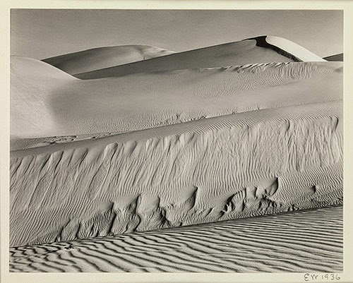
I find his imagery inspiring as his landscapes often  present a 'mood' within them. I also like how he sometimes forms abstracts to allow viewers to question what the image really is. 


Adams was a member of the F/64 group which is possibly the most famous art movement in the history of photography.

The group began in 1932 and besides Adams it consisted of 10 other photographers. 

The name referred to the smallest aperture available in large format view cameras at the time. I like how the name signalled the group's conviction that photographs should celebrate rather than disguise the medium's unrivalled capacity to present the world "as it is".


I like how they have obviously put a lot of thought in to the composition of the images as if they hadn't, their intention of presenting the "world as is" wouldn't have been as successful. 

I would like to experiment taking landscapes of the world that we live in now, in a style similar to this to see what results I can come up with. It would also be interesting to see what differences there are between the world that they captured and the one that is seen today.